
Last week was a big one for our company. Not only did we share with the world our rebrand as Thriver, but we also launched a fresh and dynamic new website, thriver.com.
The new digital face of Thriver, our website redesign came out of a need to realign our digital presence with our new solutions and visual identity, but also to more accurately represent our brand values, vision, and mission, and ultimately, how we can help solve some of the problems that companies today are facing.
This is a proud moment for our company but also an amazing opportunity for our vendors and customers to get excited and energized about how we can help fuel their companies through these unprecedented times.
Know your audience
Like any strong design project, this one started with a deep dive into understanding our target audience. Lucky for us, our internal sales, customer services, and marketing teams all have extensive information, insights, and data that helped us understand our customers and vendors more thoroughly. What we’ve learned was then distilled into guiding principles for how we approached our design. We specifically aimed to address questions like:
- What does “fueling thriving workplaces” look like?
- How can we evoke a sense of community and shared experience through the visuals, even when teams are not together?
- How can we create excitement and emotional appeal for our users about our brand and what we offer?
Another key piece of the website design process was an industry analysis and competitive research, reviewing key players and brands we admired. Our team of marketing and design experts helped to compile a document of over 45 pages of this research which gave us a wide array of insights and ideas.


Our extensive research and process resulted in 20+ stakeholders insights, 48 pages of competitor research, and 140 tasks to make the whole project successful.
While we had all this information floating around in our brains, we wanted to ensure that we would have some kind of reference to go back to as we moved forward with the project. So we created a research checklist that helped us align our perspectives and insights into a point form checklist to look back on. The key criteria are highlighted below:
Target audience:
Companies who invest in the wellbeing of their employees and care about creating a thriving company culture.
How we want to be perceived:
We want the TA to know that we understand their current pain points and hear them. We are reliable, empathetic, and vibrant (our brand values).
And lastly, what problems we are solving:
Continuing to support employees in a new reality by making our solutions easy to manage and employee focused.
Iterate, iterate, test, then iterate again
This checklist wasn’t resolved with a couple of hours of designing in Figma. Instead, the solution was uncovered through hours of exploration, edits, feedback, and iteration.

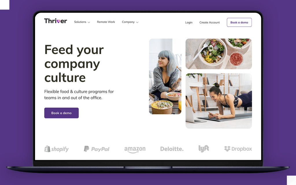
Examples of explorations for the homepage hero section. The first impression is crucial, so we explored a variety of options to come up with the strongest solution.
Another aspect of iteration was image sourcing. The images we chose needed to give a sense of community without having people too close together, evoke a sense of emotion and tell a story, and represent our diverse range of customers and partners. By the end of the project, we sourced thousands of options and explored hundreds of combinations on any given page and came up with strong combinations of images that tick all the boxes.
While it may seem like the launch of the new website means the end of this project, the thing about design is there is always a new avenue to explore, a different way to communicate, and a stronger way to create a connection with our audience. In the coming months, we will continue to gather feedback (both internal and external) and data about how our customers are using the website. With this data, we will continue to iterate and evolve our brand and how we represent it through our digital identity.
Building from a solid foundation
Knowing that this website will continue to grow and evolve, we took the necessary time to create a system of rules, styles, and parameters that would inform the rest of the website.

An example of our grid system in practice. Rather than being rigid, the system allows us to create visually dynamic layouts that feel like part of one whole design language.
We created a robust & complex system to accommodate future design needs & ongoing changes. Our task was not only to communicate visually but to delight & engage our users. We want to remain consistent and familiar to our audience, without feeling boring or repetitive, and this robust system allows us to do just that.
Final thoughts
The redesign of thriver.com was a huge undertaking, but it has also been a great thrill and a privilege for us to set the stage for the all-new visual direction of our brand. The entire Thriver team is extremely proud to share this new digital identity with the world and continue to offer outstanding solutions for our clients. Take a look at the new site now.