
Community and connection are essential themes we seek to promote through bringing people together over shared experiences. These core aspects of our mission shape the kinds of services and features we provide to our communities around the globe.
In 2015, Thriver (formerly Platterz) started as a platform focused on food programs. Over the years, we expanded our offerings to include group ordering, snacks, prepaid employee cards and virtual experiences to promote employee fulfillment and belonging – no matter where they are in the world.
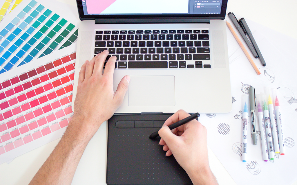
With a growing number of services to support company culture everywhere, an update to our identity was necessary to capture what we are today and where we intend to go in the future.
Say hello to Thriver’s new logo.
New name, new meanings
With the Thriver name locked in, the design team got to work. Our goals were to exemplify:
- How the word thrive makes people feel
- How we want to be perceived by our community of thrivers
- What emotions are evoked when people are thriving
The desired turnaround time forced us to lean heavily on Design Thinking and sprint methods to complete a first draft. Team members individually put together a list of words associated with each goal before reconvening. We identified common themes and grouped them by column.


The result of everyone’s word association exercises addressing the three goals.
The Logo
The team explored several different variations ranging from options that suggested growth, connectedness, flight, progression, and true north.
Ultimately, we agreed to move forward with a version that symbolically touched on the majority of the themes while remaining simple enough to reproduce across a variety of applications on and offline.

The V
Built on a grid consisting of six hexagons and circles, the resulting swathes of colors and shapes evoke an exhaustless cycle of energy pushing in the direction the compass is pointing.
“We want to inspire new ways and opportunities for people to connect and engage in their workspace.”
The V can easily sub as its native letterform or stand boldly on its own and can scale up or down to optimize legibility at various sizes.

The Palette
The updated palette features six colors made up of violets and magentas that follow a distinct wavelength, which unlike our previous orange, can sit comfortably against darker backgrounds without diminishing legibility.
“The refined palette of violet and magenta conveys meaning like authenticity and dignity while retaining the brand’s creative and playful personality.”

The Typography
To contrast the softer nature of the V, we opted for a bolder, geometric typeface in Nexa by Svetoslav Simov. Carefully kerned to best support the V they surround, we wanted each letterform to make a strong statement about who we are today as a modern, technology-driven company.
A Visual Identity to Inspire and Delight
We hope this new identity will help inspire the businesses and communities we serve to think deeply about what thriving means for them, and that a dedicated team and platform exists to help them realize that meaning.
Becoming who we’ve always aspired to be
Coming together over food will always be part of who we are, and now people can come together over other shared experiences too. We think this evolution will carry us forward in step with the communities we serve, designed in a way that can scale easily and work better in many more places.
Over the next little while, you will notice our visuals and communication align to this new direction: on the website, in advertising, and across our product.